
16-7-2026
I wasn't feeling the social media design for Siren Says! with its horizontal layout. Here's what I thought though, what if it's a vertical scroll with a background and on the top is three buttons that lead to Gallery, About and a thing called something like Hoard. Hoard would lead to a bunch of little clickable buttons with unique designs, each leading to a different user-created event. If you've played Flight Rising, it's exaclty like dom badges. I haven't decided if I'm gonna actually physically make the events or imply their existance by simply making like two and leaving the rest void. In the vertical scroll there's also the option to have a Nailed post, where, if you add links to other users of the fictional social media, they appear as a little square miniature of their profile pic.
The issue with the social media angle is that the information of the oc is presented in first person and things they don't know, but we the audience know, won't appear naturally on their profile. So I have to find a way to relay that information without ruining the illusion. What if there's a round button "outside" the social media design (which is only squares) that has either a mysterious portrait or a lighthouse that when hovered says "ask the lightkeeper" and the lightkeeper (me) tells you whatever info is missing, upon clicking, on a little window that pops up over the social media design, hiding it. No idea how I'll do the pop up effect lol. For now, I'll think about the basic social media design and hope the Hoard doesn't explode me into a million pieces (one for each button).
24-2-2025
I am proud to announce that after two years, I have finally learned how to make an image map :D Siren Says! now has an interactable landing page! Now all I need is to find a way to move around it by dragging, like in google maps. Also, finally added a scroll to the Lightkeepers Journal! It's no longer and endless way down to the buttons and other accessories. A lot of progress made today and I'm proud :) For the Siren Says! guys I'm thinking of making their individual pages like an endless scroll, social media-like. In this fictional social media, you can change the sides of your page instead of the header and you have a gallery for your photos. You can also change your icon and colors. I also want a place to list "their" music on the fictional social media page. Perhaps using the gallery as album covers with links? And a list on the pinned post with the same links. Other stuff for the landin page include an actual map on the table for the rest of the setting and a link on the shelf (old landing page) that leads to the social media for the band itself. If I'm going for the social media angle, I'm gonna also need someone to maintain/ build them, due to the setting, but everyone in the band is an idiot. Who's gonna be making all those sites? Unless they ask their friends to do it.
29-11-2024
Added the Villains Always Lose map image but I'm not happy with it. Maybe the houses should have some interaction between them? It doesn't feel like a city right now, more like floating buttons. I'm also contemplating changing the style to a more edgy one (aka more lines and/or shadows) to match the villain theme, even though that would push it away from the overall site theme. Although, now that I think about it, each portal is supposed to lead to a different world. Hm. Maybe I'll keep the Lighthouse and the Lighthouse Keeper's Journal in the same style, since they're on the same island, and change everyone else's. On that note, I might dip my toes in the other worlds too, despite the villains being unfinished. Develop the site as a whole, you know. Variety is the spice of life.
I'm thinking about artists who post daily or, at least, very often and wonder. What if an artwork takes multiple days to complete. What about pieces that take a month to see the light of day or even years, in the case of endless wips. Do you just keep posting the same sketch/progress over and over again? If you divert your limited time to somewhere else, say a quick sketch to post, the original piece will take even longer to complete. In the modern age of social media art that takes ages to make isnt viable. Hm. Now I'm thinking about textile arts and knitting. Those do take wayyy to long to complete and yet they are as popular as ever. My instagram feed is nothing but knitting/crocheting pages and it brings me joy every time I see them. Perhaps the trick is to have multiple wips going at the same time, that way you can showcase the progress of different pieces to avoid boredom.
By the way, this page should probably get a scroll or smth it's getting too long lol.
2-9-2024
Legit a year later since the last entry lol. Added some buttons to the bottom of the Lightkeepers Journal cause I have decided they're cute after all. I'm finally drawing that interactive map for Villains Always Lose and it's going to be either buttons or I'll use Aegi's method, who very kindly has written up a step-by-step guide of her experiments. I tried to make the landing page a little more mobile friendly and the lighthouse disappeared, so I reverted it back to how it was. Maybe I'll take another look at it once I figure out the map.
3-9-2023
How cohesive should each world's pages be? I need to go back to the drawing board to think of an overall design for the Villains at least, and decide on which elements should be changeable and personal to each character. Perhaps an extra page for comic sketches, writings and happenings that evolve multiple of them. The interactive map is such a roadblock. I really want to learn how to make it though, it will look so cool. This also falls in the overall design of the Villains section, as the artstyle of the city should be the same as their portraits and pages, they should all read as the same location. I don't want it to follow the same format as the Lighthouse and Journal though. Perhaps something more aggressive? Poster style could also work, with its confident shapes and bold colors. Black and white 'pencil' sketch would add character, but since they're color-themed, each character could have their color as an accent for like their eyes, effects, etc.
24-7-2023
Haven't played around with HTML for a while, kinda miss it. There's something very sweet about making a little corner for yourself on the internet and building it with your own two hands. Lately, social media has been draining. Now, where should I start? Probably with Villains Always Lose. It has some pages already written, Imm, Abe and Mirage if I remember correctly, and the lore about it is very clear in my mind. First, it needs some navigation buttons to get you back to the lighthouse, right now you enter the Immortal City and are trapped in there forever (lore-accurate, but not very pleasant for the user). Next, the city itself should get its interactive map. I remember that was the roadblock I faced last year and I couldn't progress past it, as all the tutorials and guides I found online were suggesting the use of java. But I've seen other neocities sites with the feature, so there should be a way to impliment it.
1-11-2022
The blurry Lighthouse in the landing page was bothering me, so I traced it over in vector lol. It looks better now, even though it's probably not noticable and smaller screens never got to see the three pixels tall tower. From now on I have to remember to draw the images in vector. Next, I want to try delving into one of the worlds to flesh out some lore. It would look nice with this new lineart style. To tell you the truth, I haven't gotten the chance to draw my ocs in this style, as it's only like a week old. I'm trying out a 'newest first' kind of posting in the journal, see how it goes. I wonder what other people are doing with their journals as time goes by? Can they still be navigated?
30-10-2022
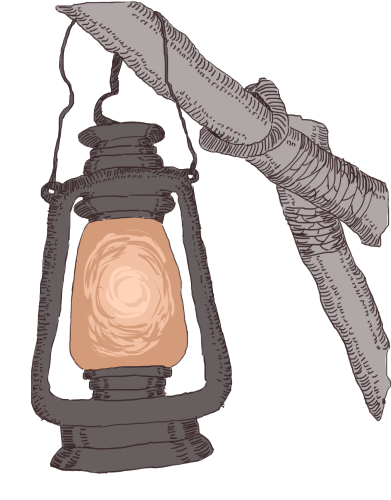
After a very very long time, I've finally managed to make some images for the site. I've been debating about what style I wanted to go for, since my usual style takes a lot of time and effort and I didn't want that kind of stress associated with this place. These days though, I've been practicing inking digitally. It's a lot faster and the scuffed result is very fitting for this scuffed site. The grey tones are calming. Bright colors wouldn't fit this place, at least not the Lighthouse and Lightkeeper pages, as it's supposed to be a little melancholic and lonely. Lighthouses for me are a symbol of loneliness and I wanted these pages to reflect that. They also symbolize hope. They light the way for vessels when they're lost and signal the end of their gruesome travels. Hence why the Lightkeeper has a lantern.
The world portals will be replaced by actual windows to the worlds they contain. I'm not sure if this can be done here, as I've heard it needs java, but maybe I can find a way around it. If the portals get implimented like this though, the Lighthouse page will be unusable for mobile. I wonder if I can keep the buttons for mobile, but turn them into portals on desktop? Now that I think about it perhaps I should use vector for the rest of my images, the Lighthouse is so blurry lol.
Interesting Sites


